Challenge
As the Lead Designer on this effort, I was tasked with developing a full brand identity for SISG (a new division of parent company Sensory Interactive) from the ground-up. The goal was to create a distinct and cohesive visual system to establish SISG as a standalone brand while maintaining a connection to its roots and existing clients/partners.
SISG Brand Identity
Client
Sensory Interactive Solutions Group
Industry
B2B | Technology | Digital Signage
Role
Lead Brand Designer, Web Designer, Motion Designer
Discovery
Sensory Interactive Solutions Group (SISG) was a division launched to serve as a dedicated expert within the digital signage market, providing specialization and deep technical knowledge.
Development
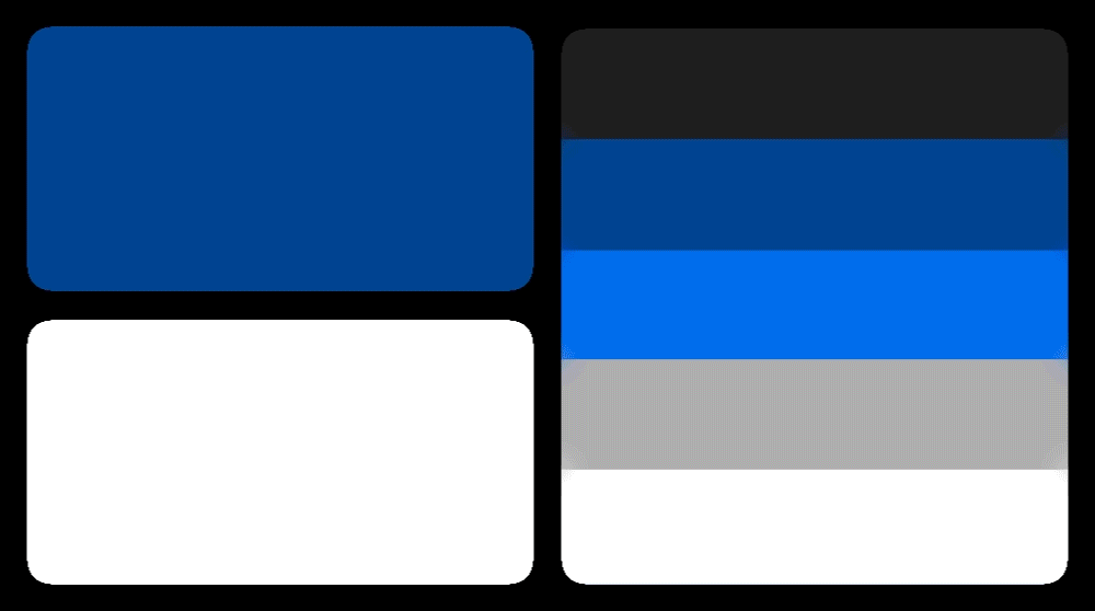
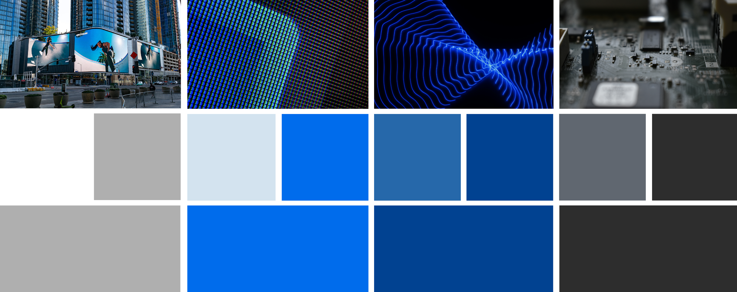
Color Palette
Drawing from our Discovery insights, we developed a cohesive color palette aligned with the brand’s intentional direction.
The blue-grey tones were chosen to reflect a bold, technology driven identity. These colors also reinforce values such as trust, reliability, and strength - attributes at the core of the SISG team.
Typography
The brand typography was heavily inspired by the architectural quality of the signage SISG produces.
The typeface FLEXIBLE strikes a balance between architectural influence and the dynamic energy expected in sports and entertainment environments; positioning the brand as both reliable and forward-thinking.
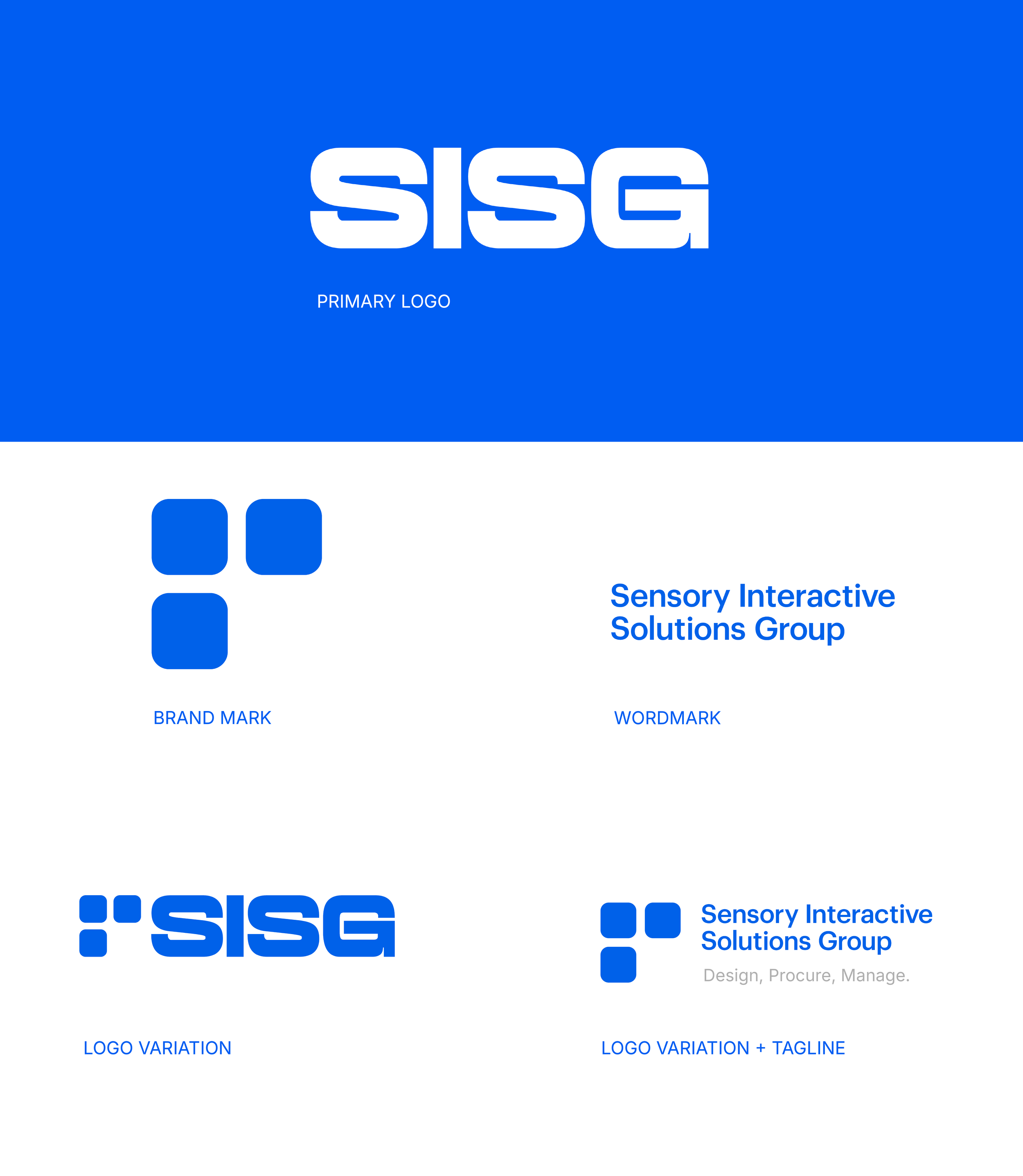
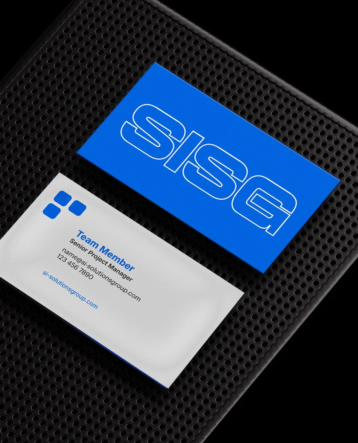
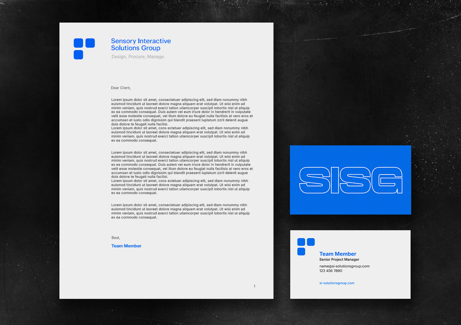
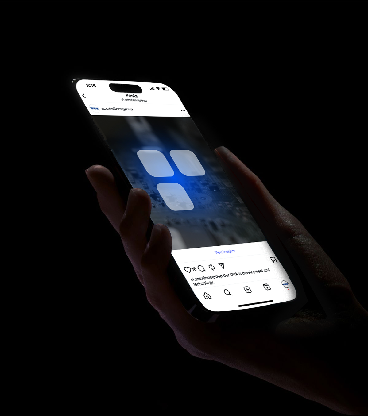
Brand Mark
The rounded-square brand mark emerged as we explored the FLEXIBLE type further.
I was intrigued by the way the characters invoked geometry and it led me to explore what blocking out those shapes would create. The mark that emerged felt very true to the roots of SISG’s architectural background and also blended smoothly with our bold typography.