Red Onion Rebrand
Challenge
Red Onion is one of my favorite restaurants of all time; however, the existing branding lacks a distinct voice and the thoughtful identity such a beloved destination deserves. I set out to reimagine Red Onion’s brand identity—developing a consistent and elevated visual system as memorable as the food itself!
Client
Pitched to Client
Industry
Hospitality | Food & Beverage
Role
Brand Designer, Layout Designer
Discovery
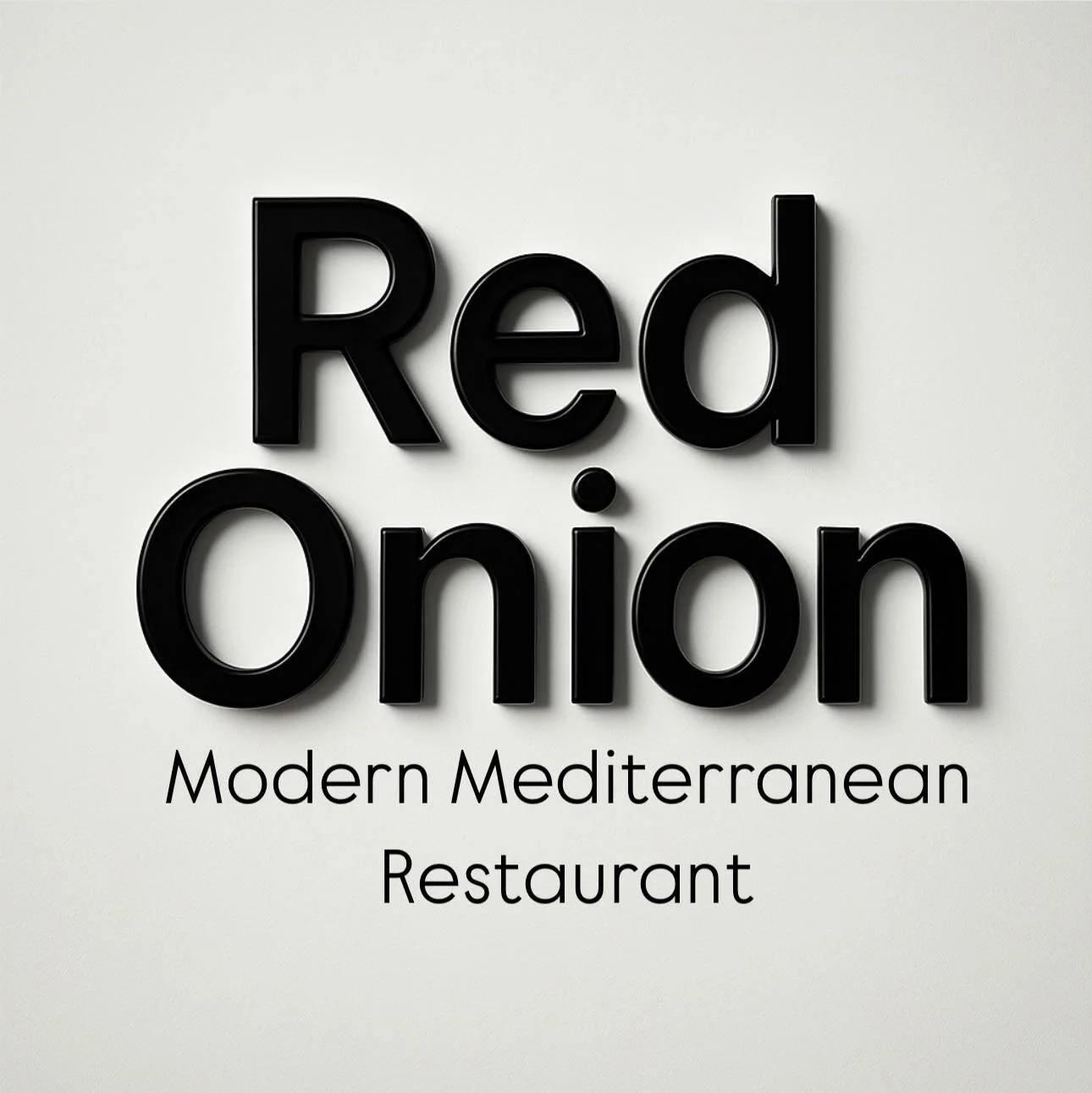
The Current Logo
Red Onion’s current logo embraces simplicity almost to a fault, and the design decisions that have been made (drop shadow, font selection) do not feel true to the restaurants identity.
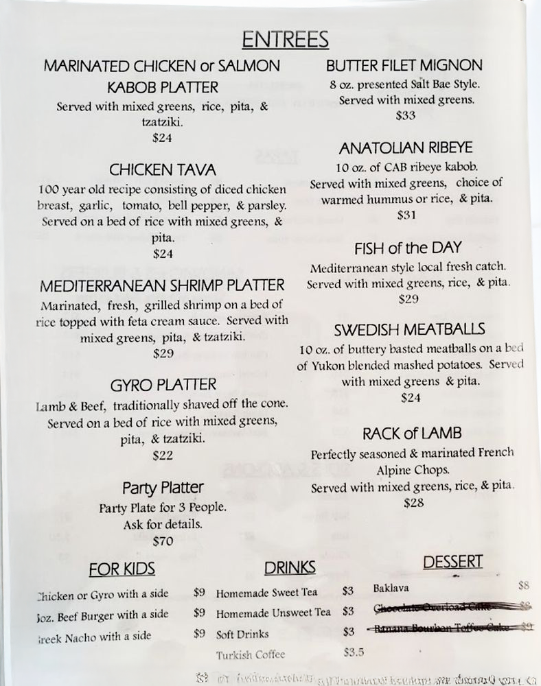
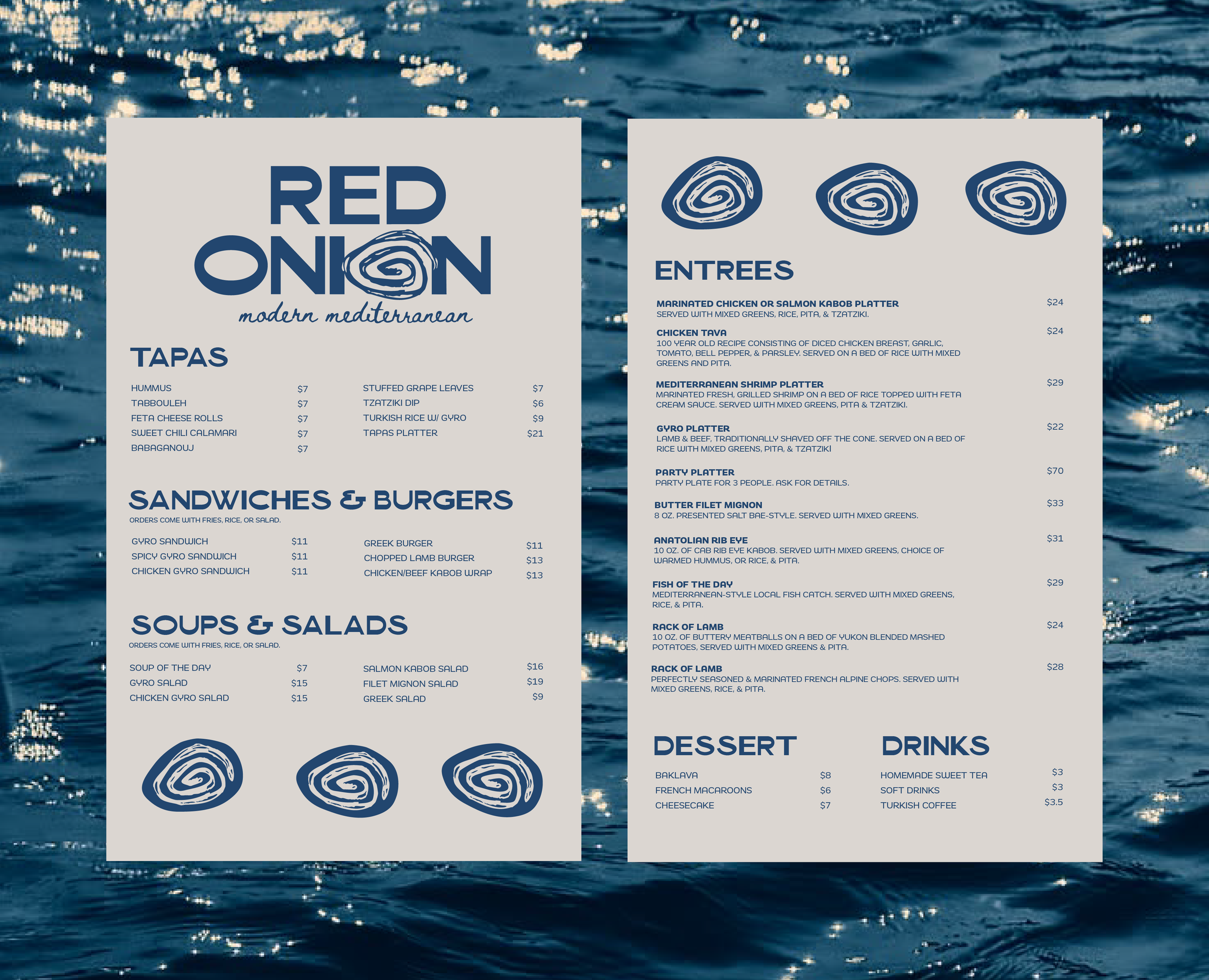
The Current Menu
The menu does it’s job of informing guests what the restaurant has to offer, but it does not contribute to a unique dining experience nor correspond to the logo.
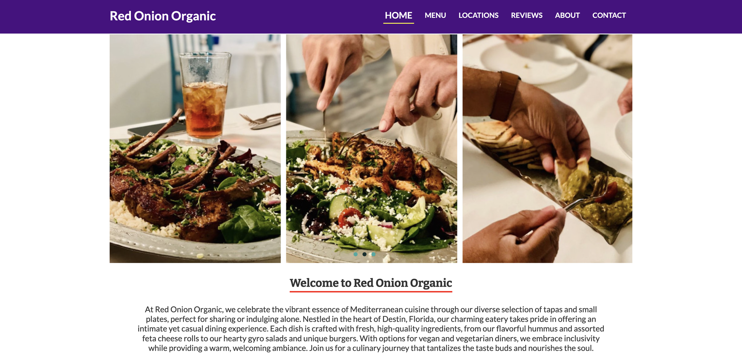
The Current Website
The website displays great imagery of the food, but feels outdated (old restaurant name, no real visual intrigue). Again here, the design decisions that were made feel disjointed from other brand elements.
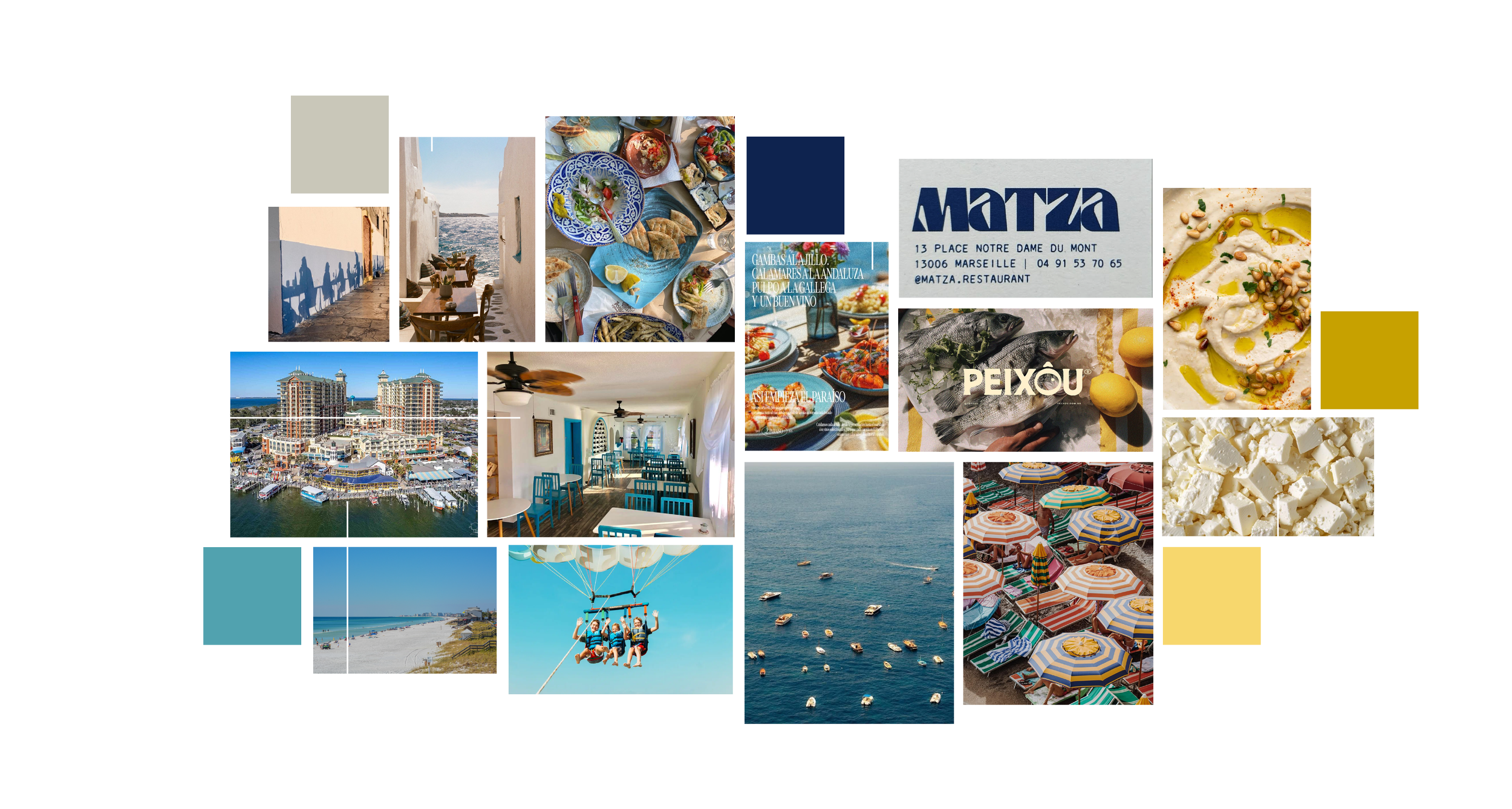
After gathering all existing materials, I created a mood board contextualizing the restaurant’s identity in it’s location and influences:
Process
After creating the mood board, I started iterating logo designs with type faces that were felt more in line with the character of the restaurant.
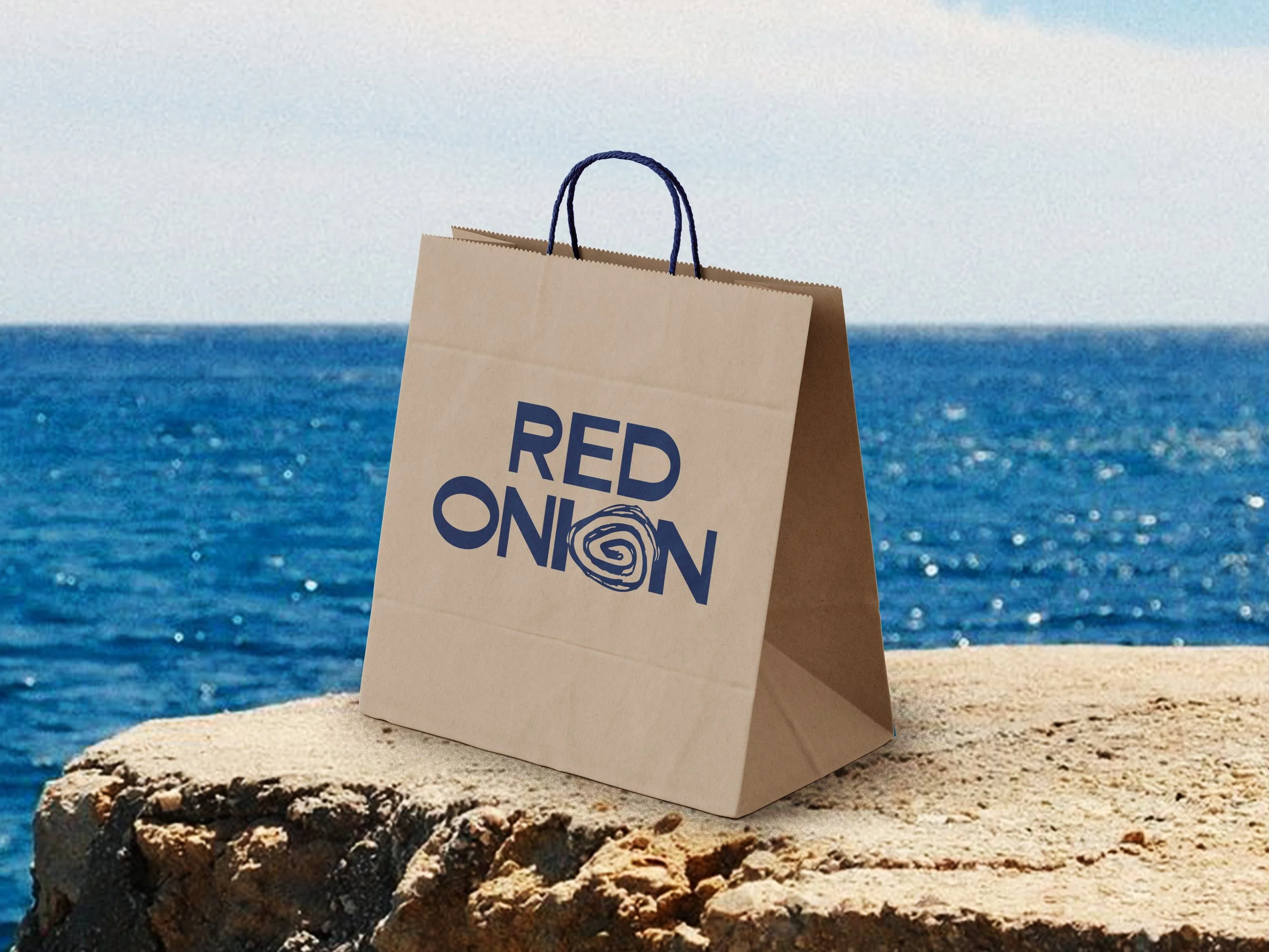
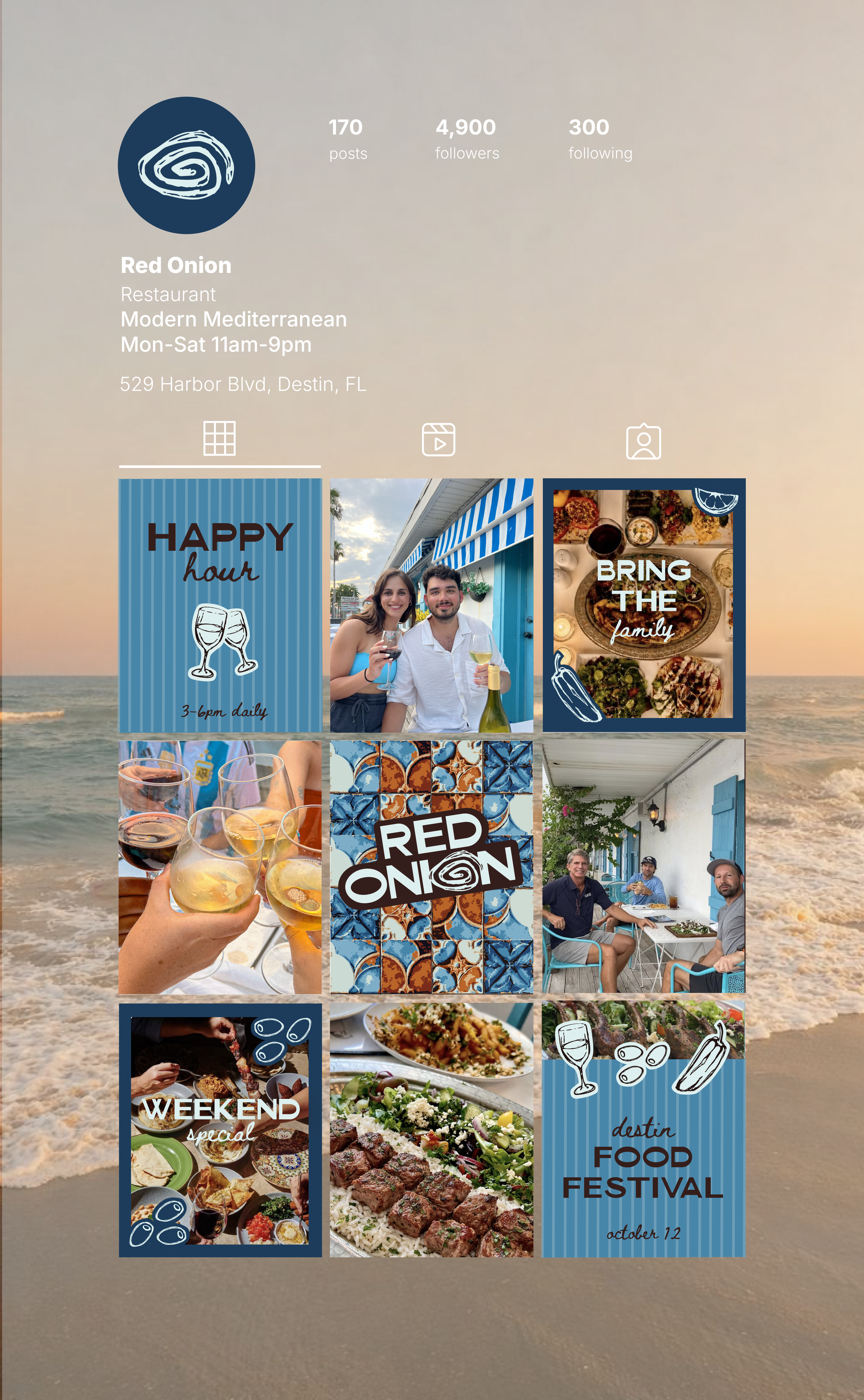
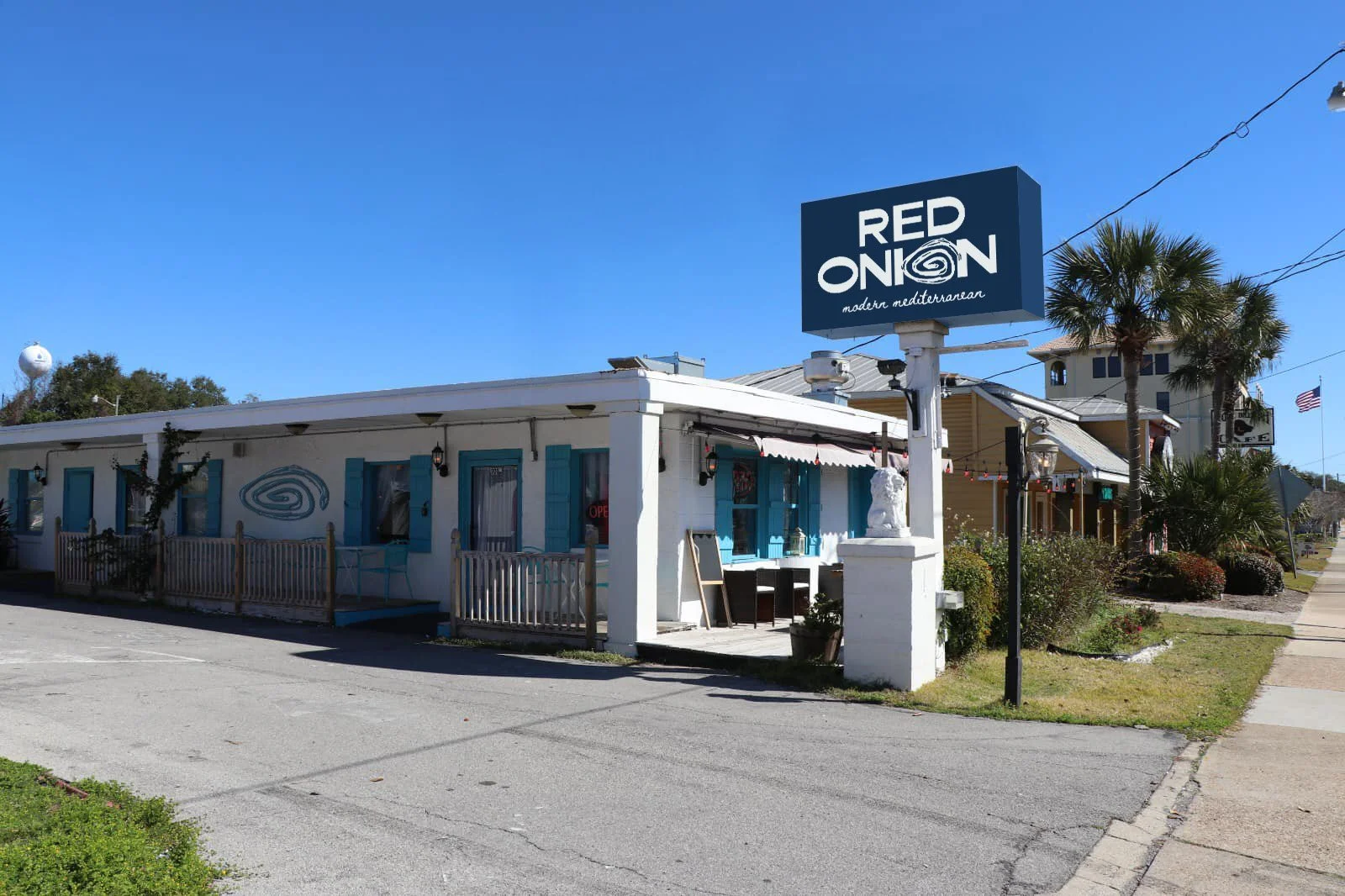
Brand Concept
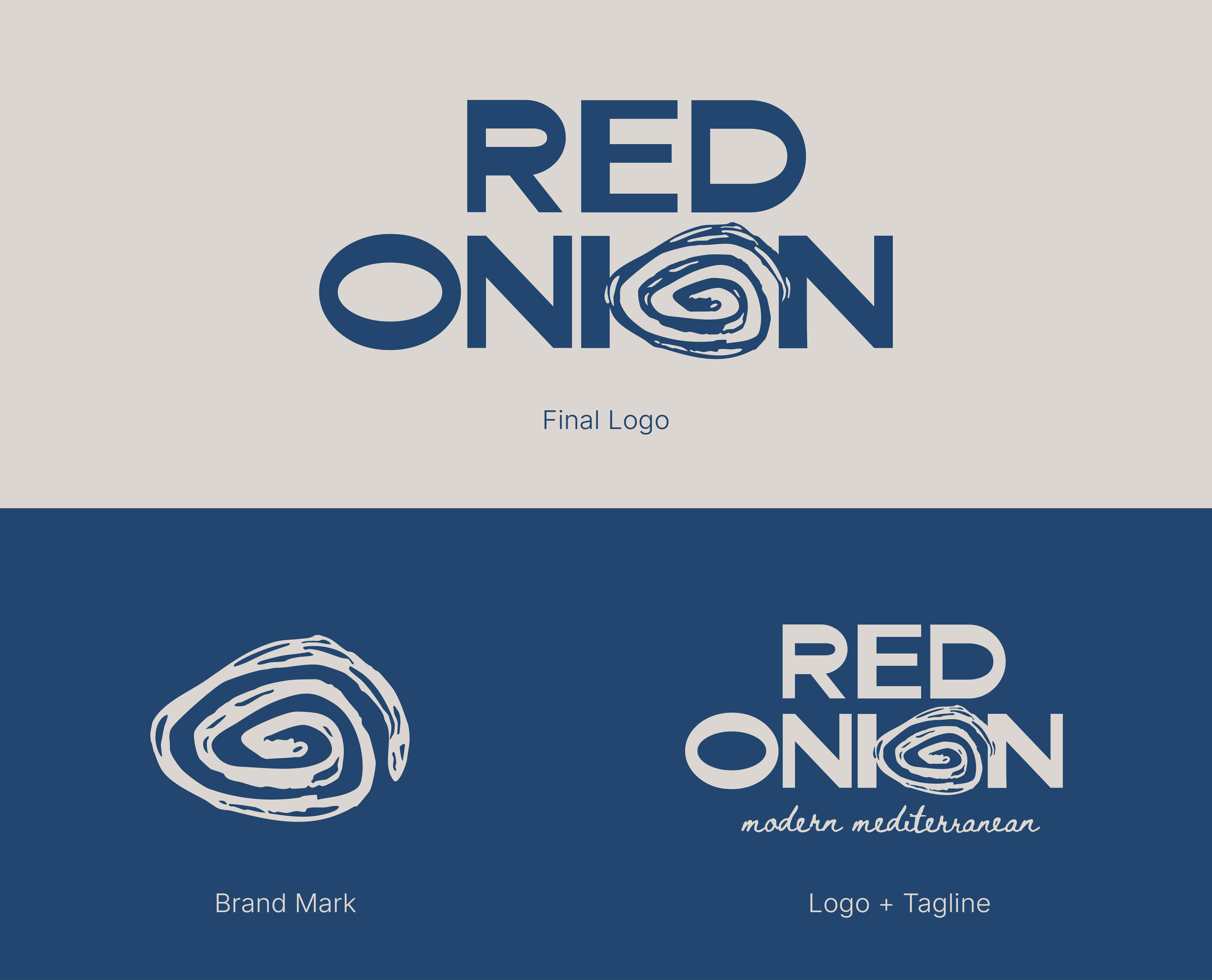

Brand In Use